
🔧 The Story Behind the Logo: Cogs, Colour, and Collective Memory
Post Summary: A deeper look at the meaning behind the Equality Without Distinction logo. From its mental health roots to its evolution as a symbol of memory, philosophy, and shared voices — this emblem tells a story of its own.
The Story Behind the Logo
From mental health metaphor to historical memory machine.
Why this new emblem means more than just branding.
Logos aren’t just visuals — they’re language without words. And for me, this new logo isn’t just an update. It’s an evolution.
The original version was rooted in a metaphor I still stand by — the brain as a set of interconnected cogs. Just like our minds, each cog had a purpose: thought, emotion, memory, focus. It was my way of expressing mental health in motion, and the colours — metallic gold, teal, and bronze — were chosen simply because they felt strong, alive, and honest.
But my focus changed. I wasn’t working directly in mental health anymore. I was working on memory. On history. On the invisible gears that shape our world — the ones we were never taught to notice.
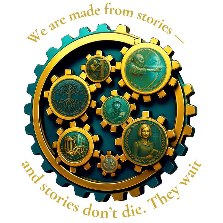
The updated logo takes that same idea and spins it forward. The colours remain, but the meaning behind the gears has deepened. Now, the outer ring represents the Self — the whole of who we are. The inner gears represent all those who have influenced us: our heroes, our ancestors, our teachers, our forgotten storytellers.
Look closely and you’ll see nods to key figures: a Lakota elder representing Joseph M. Marshall III, a torchbearer symbolising knowledge passed down, an ancient builder, a broken temple and a rising one, and even subtle tributes to historians like Tony Robinson and Lucy Worsley — not likenesses, just respectful echoes.
The golden tree — the Equality Tree — is the heart of it all. It represents what we grow when everyone’s voice is heard.
If this ever appears on merchandise, I’d want people to choose their own inner symbols. The outer gear is universal. The inner gears? They’re yours.
“We are made from stories — and stories don’t die. They wait.”