

The Flyer
Here’s the full flyer exactly as it appears in print. Click to view full size.

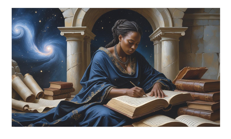
She Wrote to Be Remembered
The central figure honours the countless women who created, taught, governed, invented, and wrote—often without credit or preservation. The night sky and stone arch hint at endurance: knowledge carried through time, even when names were lost. The open book counters the idea that women’s histories are peripheral; it seats women at the desk of history, not at its margins.
The paired title links intent and responsibility. “She Wrote to Be Remembered” acknowledges the purposeful act of recording a life or idea. “We Write So She Won’t Be Forgotten” invites the reader to join the work—sharing articles, teaching, posting, discussing—because remembrance is a collective act. That’s the core of Equality Without Distinction: valuing people by their contribution, not by the labels assigned to them.
The blue‑and‑gold palette matches the book’s visual language. Blue conveys reflection and trust; gold signals significance. Together they promise continuity: we will carry these voices forward.
Before settling on the final illustration, we explored these alternate concepts:


The Story of the Stars
The gold medallions began inside the Equality Without Distinction emblem: not review ratings, but subject stars. Each is a small relief—laurel, fabric folds, tools and books—so they feel crafted and specific. As a set they read like a matched collection; individually they signal the different pillars that shape the book.
Their titles weren’t invented for design; they reflect the book’s real Amazon category performance at the time:
- #6 — Diversity & Multiculturalism (Social Science eBooks)
- #132 — Gender Studies (Kindle Store)
- #1,499 — World History (Kindle Store)
We then matched each category to a visual identity: Diversity & Multiculturalism (rooted and human), Gender Studies (warm, approachable, grounded), Women in History (dignified and scholarly), History of Civilisation & Culture (grand and architectural), and Philosophy (hands‑on craftsmanship and depth of thought).
The gold finish isn’t self‑congratulation; it’s a cue that these domains are equally important to how the book works—research‑driven, people‑centred, and globally aware. Enlarging the stars here online improves legibility on mobile, and the vertical composition guides the eye from theme to theme. Taken together, the stars act as a quick legend for new readers: this is not a narrow shelf of history; it’s a bridge between disciplines and cultures.
Practically, the stars also connect the flyer to reviews and rankings. Where a pull‑quote shows impact, the subject stars show where that impact lands—across gender studies, history, philosophy, and multicultural inquiry—underscoring that the book resonates in multiple conversations at once.

Download & Share
Help us spread the word — print and display the A4 poster, or share the flyer in your local community.
📄 Download A4 Poster 📄 Download Flyers (4‑per‑page)
Join the Mission: Print and share these resources at community spaces, events, cafés, libraries — anywhere people gather to read, learn, and talk.